The All events view in the Autonomous Humans prototype: a program of ten sessions shown as one table with series, dates, a planning-to-live progress column, and cohort labels

Autonomous Humans: running an events program end to end

Autonomous Humans is an initiative to help non-technical people learn to use AI in their work: courses, cohorts that learn together, and a rolling program of online events. The teaching model is clear. The software to operate it doesn’t exist, because event tools run one event at a time and the program lives in a spreadsheet. This is the design prototype we built to close that gap, and a walkthrough of the thinking behind its screens.

Updated
July 12, 2026
Reading Time
8 min
Autonomous Humans — an interactive prototype. Click to open it live.

A program to teach AI, and no software to run it

Autonomous Humans is an initiative with a simple goal: help people who don’t write code learn to use AI in their work. The teaching happens three ways. There are courses you can take, cohorts that move through the material together, and a rolling slate of online events: a session for finance folks one week, one for People & HR the next, a briefing for executives after that. Different rooms, different audiences, and every one of them is supposed to clear the same quality bar.

Running that slate turns out to be its own job. A dozen sessions are in flight at any moment, each at a different stage, several live in the same week, none allowed to slip. Plenty of platforms will host one event well: a page, a registration form, a reminder sequence. What none of them offers is the program itself as something you can operate. The cohorts live in one tool, the events in another, and the thing the operator actually manages survives in a spreadsheet and their memory. That gap is what we prototyped against.

The prototype came out of one of our design sprints, and it’s an exploration rather than a shipped product, so read it as “here’s the problem, and here’s what a better version might do.” The screens are real; the company, people, and numbers inside them are placeholder data, which is worth saying now because I’ll be quoting those screens as we go. What’s worth your time is the thinking: what the home screen is, how one bar gets held across many rooms, and where agents fit between the operator’s decisions.

The home screen is the program

The obvious thing to build is a beautiful single-event page plus a list that links out to each one. The prototype does the opposite. The home screen, labelled All events, lays the entire program out as one table: one row per event, ordered by date, the whole slate visible at once. The unit is the program, not the event. An operator’s day is triage across the slate: which sessions are healthy, which are behind, what goes live this week. A tool that makes you open ten pages to answer “how are we doing?” doesn’t survive that day.

The vocabulary on the screen carries the cohort model. A Series is a theme that travels: AI Skills, AI in Action, Tool Briefings, each a format that can run for finance one month and HR the next without losing its shape. Cohorts say who each session is for, by function (Accounting, Manufacturing, Sales, People & HR) or by seniority (Executives). A row reading “AI Skills: spring kickoff for finance” tells you what it is, who it’s for, and how it fits the rhythm, without opening anything. The tabs across the top finish the scan: All 10, Published 2, Confirming 1, Planning 5, Past 2. Before you’ve clicked, you know half the program is still upstream.

Every session walks the same route

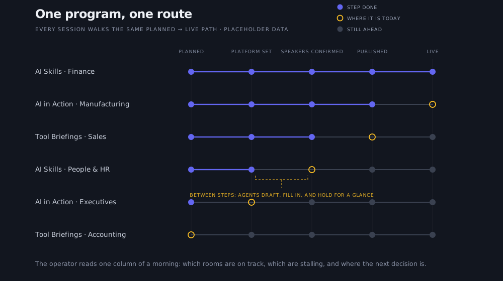
With one session, quality is whether it went well. With ten, quality is whether the tenth is as good as the first, and that’s where programs quietly rot. The prototype’s answer is structural: the Progress column tracks every event along an identical route: planned, platform set, speakers confirmed, published, live. The app’s own description of a cohort compresses the intent into four words:

Different rooms, one high bar.
Six sessions for different cohorts shown as rows, each at its own point on the identical five-step route from planned to live. Filled dots mark completed steps, a ring marks where each session is today, and a bracket notes that agents carry the paperwork between decisions.

One program, one route (placeholder data). Because every session walks the same path, one glance down the column shows which rooms are on track and which are stalling.

Because every session walks the same path, one glance down the column tells the operator which rooms are on track and which are stalling, whatever cohort they serve. Registration rides alongside as a separate health signal (360 of 500 for one session, 388 of 400 for another, 0 of 250 for one not yet open), so sign-up pace never gets confused with operational progress. The palette stays muted, green only for done, because this is a screen someone lives in all day.

Approvals guard the bar; agents do the paperwork

The bar you can see in the Progress column gets defended in one concrete place: approvals. Speakers, organizers, and behind them co-hosts and member companies all pass through the same review before they touch a room. Opening a speaker shows their headline, their areas of expertise, whether they’re actually shipping the thing they want to talk about, a short vibe-check note, and whether they’ve accepted the Code of Conduct. You read it, then Approve or Deny. The product’s own reason for vetting this way—the talk earns the room because the work is real—is the quality bar in a sentence. The queue sits on the nav with a live count, so the step most likely to stall an event stays in sight until it’s cleared.

The other half is what happens the instant you decide. Approving a speaker doesn’t hand you a blank email: the app drafts the confirmation, fills in the event, cohort, date, and organizer, and either sends it or holds it for a glance first. Every routine message around a session works the same way—the call for speakers, the confirm-or-decline, the ask to a co-host, the attendee reminder—each one set once to send automatically, draft for review, or stay off. This is where agents-in-the-loop stops being a phrase. The operator makes the judgement calls, agents do the paperwork between them, and that’s how one person holds ten events to the same bar without the afternoons disappearing into email.

Luma stays the front door

The design also declines work on purpose. It doesn’t try to be a registration platform: attendees discover sessions and RSVP on Luma, which they already know, and those registrations sync back into the program view as the small “Luma · synced 2m ago” line and the “360 / 500” beside each event. Rebuilding a sign-up flow that already works would add surface without adding value. The prototype’s job is to be the one place that sees every event, and it leaves the rest to the tools that do their part well.

The same scoping shows everywhere. The Directory holds people, companies, and communication because an operator coordinates speakers and member companies, and it stops short of becoming a marketing database. One small detail on the screen says a lot about the intended posture: the person running the program is tagged both admin and attendee—an insider enabling colleagues rather than a broadcaster reaching strangers. Everything that made it in serves the same job: see the whole program, spot what needs attention, keep the bar even.

Vibes: what the room felt like feeds the next one

The last surface in the workspace is the one I’d have shown first if this were a demo, and it lands better once you know the rest: Vibes. After a session, attendees flag what mattered: who to invite next, what to schedule and where, which parts of the material earned a follow-up. Those signals route into planning for the next event in the series. The bar isn’t only supposed to hold across rooms; it’s supposed to rise from one session to the next, and a good night becomes an input to the planning screen instead of a memory in the operator’s head.

What the program does next

The initiative keeps teaching: more cohorts, more functions, the same bar. The prototype’s job was to find the shape of the software before anyone commits to building it, and the shape it found is specific: the program as the unit, an identical route every session walks, approvals where the bar gets defended, and agents carrying the routine work between an operator’s decisions. It’s also a working example of how we think about software generally: design around the one team’s actual job, then build and run it for them like a product. If the cohorts grow the way the initiative hopes, the operating surface grows with them. That’s the point of designing it now.

Article by

Rahul Parundekar

Rahul Parundekar

San Francisco-based consultant specializing in cutting-edge Generative AI (GenAI). I partner with organizations to pinpoint high-impact opportunities, streamline AI operations, and accelerate the launch of innovative products—efficiently, cost-effectively, and with controlled risk. Founder of Elevate.do and A.I. Hero, Inc.