A tutor bounded to the lesson
The panel is stamped UNIT 1 · 1.2, labeled TUTOR, and introduces itself with a promise about scope: "Ask me anything about this lesson: the loop, stop_reason, the three anti-patterns. I answer from the lesson itself." Before the learner types a word, the assistant has said what it will and won't do.
The reason for the boundary is the learner's position. The whole reason someone takes a course is that they can't yet grade the answers they get about it. An assistant hooked to the entire catalog will answer a question from two units ahead fluently and sometimes wrongly, and the learner has no way to catch it. After the first wrong answer they do catch, everything the assistant says needs double-checking, and an assistant you double-check has stopped helping. Bounding the tutor to the lesson removes the surface where that damage happens, and it makes every answer checkable against the page it came from.
Current tutor products draw the line much wider. Khan Academy's Khanmigo, the best known of them, is built into the platform's whole content library and can help "with almost any academic subject, including math, science, coding, history, and humanities" [2]; its guardrails aim at pedagogy (it declines to hand over answers) and at safety, with monitoring for parents. For a student with a teacher nearby, the platform is a reasonable place to draw the boundary. For a working adult learning alone, with nobody to catch the confident wrong answer, it leaves the failure possible on every page. Lemur moves the line to the lesson.
Test yourself flips the same tutor from answering to asking. Reading an explanation feels like progress whether or not it stuck, so the tab that asks the learner to produce the idea is the check that tells. It sits one tap from Ask, so proving you've got it never means leaving the page. And because the quiz is scoped to the same lesson, every question has an answer the learner was actually given, so a wrong answer points at a real gap rather than a trick.
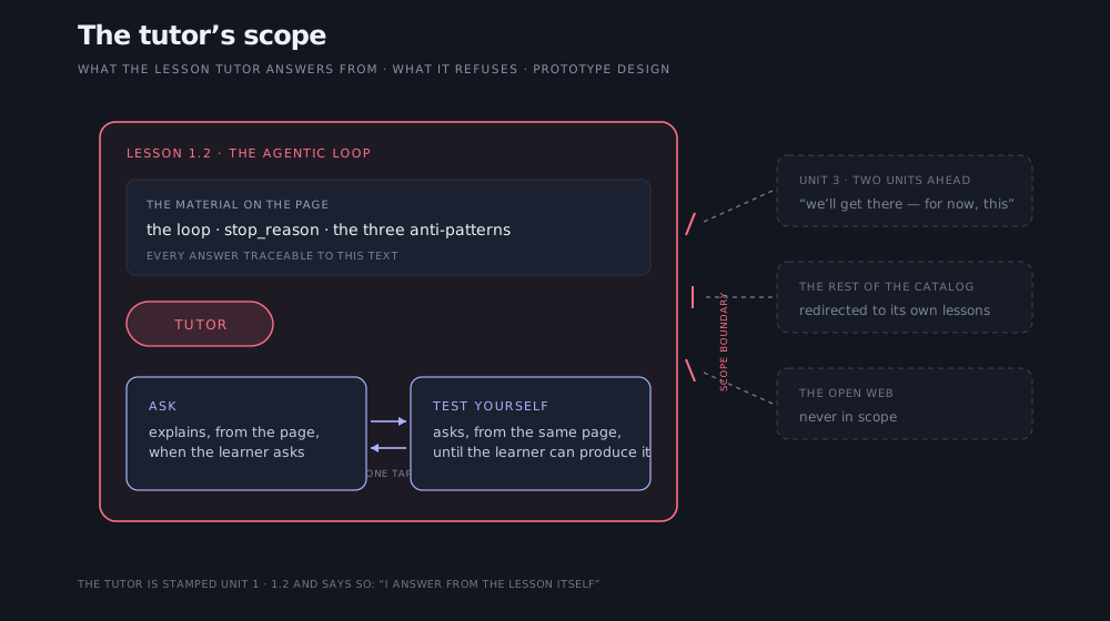
The tutor's scope. Inside the boundary: the lesson material and the two modes, one tap apart. Outside: later units, the rest of the catalog, and the open web, all redirected, with the refusal worded like a good teacher's.
The unforgiving part of the design is the edge. Learners ask things that sit just outside the lesson: a definition from the previous unit, a comparison that reaches forward. The tutor has to be genuinely helpful inside its lines and graceful at them. Tuned too permissive, you're back to confident wrong answers; tuned too strict, the tutor feels evasive. Getting the refusal to sound like a good teacher's "we'll get there. For now, focus on this" is most of the work, and it's the kind of thing you only get right by watching real learners hit the boundary. The panel also stays beside the lesson rather than floating over it, because the page is for reading and the tutor should wait until it's wanted.