AI Hero Design System v0.2, the visual language coding agents build from

The design system behind software that ships on day one

Coding agents write most of our UI now. That changed what a design system is for: it stopped being a style guide for designers and became the thing that makes agent-built screens come out right. We settled ours before we designed a single app: one ink ramp, one accent, a fixed status vocabulary, a composer on every surface. That decision is the reason the prototypes in our gallery read as one body of work. If you’re wondering how to keep quality steady when agents do the building, this is the setup that’s worked for us.

Updated
July 12, 2026
Reading Time
8 min
AI Hero Design System — an interactive prototype. Click to open it live.

Introduction

A coding agent that builds you a settings screen on Monday and another on Thursday will hand you two good screens that don’t belong to the same product. Different spacing, different button treatments, a new colour that seemed helpful in the moment. The agent isn’t wrong either time. It just has no memory of the taste decisions you made last week, so it makes fresh ones, and fresh decisions drift.

That’s the problem this system exists to solve. AI Hero builds bespoke software for each customer, and coding agents write most of the code, including the UI. At agent speed, a human can’t sit in review catching every spacing choice on every generated screen. The taste has to be written down in a form the agent can follow. So before we designed the first app, we settled the design system, and every design since has inherited it. This post walks through what’s in it, how the agents consume it, and what that’s bought us across the prototype gallery.

Four principles, each one line long

A system a coding agent can follow has to be small and absolute. Rules with judgment calls in them (“use shadows tastefully”) are exactly where generated screens drift, because the agent exercises the judgment differently every time. So each principle is stated as a rule you can check a screen against.

Restraint over decoration. If a divider, shadow, or colour can be removed without loss, remove it. In practice: no drop shadows piled on cards, elevation is a single one-pixel hairline reserved for modals and the composer, and a cool neutral ramp of fourteen steps carries almost the entire interface. One type family, Geist, runs from the largest heading to the smallest label, with its monospace cut for the little uppercase tags that organize a screen without adding a box. Motion is rationed to genuine moments of confirmation.

One accent per surface. A single saturated indigo marks the primary action, the focused element, and links. The rule allows it on at most one or two affordances per surface and nothing else. In the drafting prototype the one indigo thing is “New draft”; in the engineering view it’s “New spec PR.” Someone who has used one prototype can open another they’ve never seen and find the primary action in the first second. Add a second accent and that signal is gone.

Write like a consulting partner. The voice rules are as checkable as the visual ones. Short sentences, full stops, no exclamation marks, specifics over adjectives. When a prototype reports what its agent did, it reads like a colleague: “Paused the schedule so it stops retrying and drafted an incident note for finance.” A small lexicon is simply banned—seamless, revolutionary, game-changing, and even AI-powered, because software that takes actions earns more trust by stating what it did than by advertising what it is.

The composer is the page. Every surface gives the user a way to send a paragraph. The instrument is the voice bar, one object that takes text, files, and voice, with the default prompt “Send a paragraph…” It’s the one element granted real elevation off the page, and the layout is arranged around it. Software built around agents needs a place to state intent in plain language more than it needs another toolbar, and making that place the centerpiece is what separates these designs from a chat widget parked in a corner.

A colour vocabulary agents don’t have to guess at

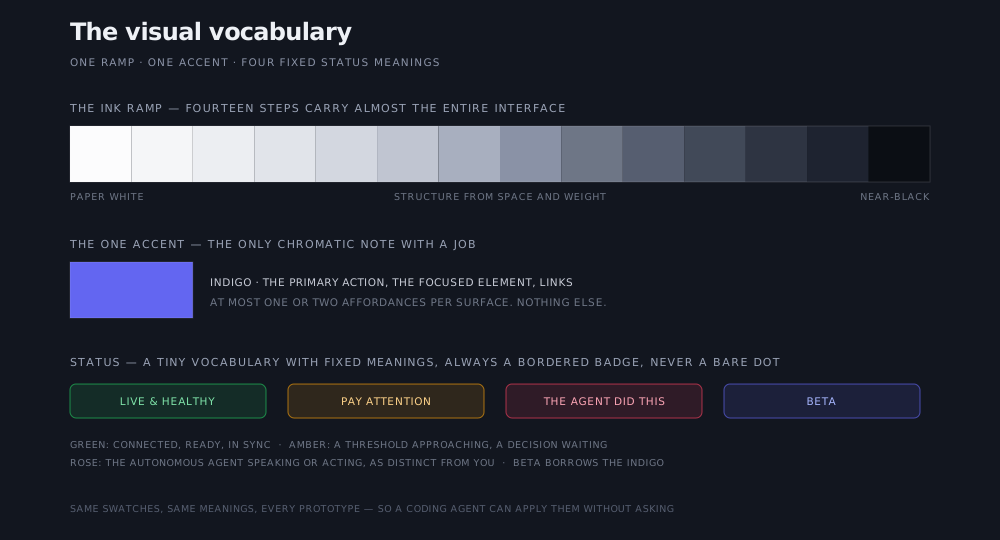
On top of the ramp and the accent sits a tiny status vocabulary, and every colour in it has one fixed meaning across every prototype. Green means live and healthy. Amber means pay attention: a threshold approaching, a decision that can wait but shouldn’t wait long. Beta borrows the indigo. And rose marks the autonomous agent—the agent speaking or acting, as distinct from you. Status never appears as a bare coloured dot; it’s always a bordered, tinted badge that reads without a legend.

Three rows of swatches: a fourteen-step monochrome ink ramp from paper white to near-black, a single indigo accent swatch, and four status badges: green for live and healthy, amber for pay attention, rose for actions the agent took, and an indigo tint for beta.

The visual vocabulary: one ramp, one accent, four fixed status meanings. Same swatches, same meanings, every prototype, so a coding agent can apply them without asking.

The rose convention does the most work, because it answers the question agentic software raises constantly: did I do this, or did the agent? A user reads a rose badge as “the AI did this” in one prototype and reads it identically in the next, without being taught. For the coding agents the fixed meanings matter just as much. A palette this small, with meanings this rigid, is something an agent can apply correctly on a screen nobody had imagined a week earlier. A rainbow with per-surface conventions is something it would have to guess at, and it would guess differently each time.

Served where the agents build

Writing the rules down isn’t enough if they live in a document the agent never opens. The system is packaged the way our tooling already works: we serve it as a shadcn registry, so when a coding agent scaffolds a new screen it pulls the real components and tokens from the system instead of improvising its own. The principles travel as the written rules above; the pixels travel as code the agent installs. A new prototype starts from the system by default, and drifting away from it would take deliberate effort rather than a moment of inattention.

That ordering (system first, designs second) is the part we’d repeat even if everything else changed. The custom part of each prototype is the workflow: what the software does, how the agent behaves, where the person stays in charge. None of that time should go to re-deciding what a button looks like, and with the system in place, none of it does.

A design system is the sum of its refusals

Every rule above says no to something: the second accent, the decorative shadow, the exclamation mark. That’s deliberate. A system that permits everything constrains nothing, and a screen generated against it drifts back into bespoke chrome one exception at a time. The refusals are also what keep the surfaces calm, which matters for software where agents act: when the agent has just paused a running job, the interface should carry composure, and a quiet monochrome surface with one point of colour does that better than a dashboard fighting for your attention.

The payoff is sitting in the gallery. The triage console, the eval dashboard, the drafting tool, and the engineering view were built as separate explorations, yet they open looking deliberate and behave predictably, and moving between them costs you nothing because the grammar stays the same even though the nouns change. The business argument for building fitted software this way, and for the team that keeps it current, lives in the bespoke SaaS post; this one is the part that decides what the screens look like. For a customer, it means the software we hand you on day one already looks and behaves like a finished product, and the app we hand you six months later will still feel like the same hands made it.

Article by

Rahul Parundekar

Rahul Parundekar

San Francisco-based consultant specializing in cutting-edge Generative AI (GenAI). I partner with organizations to pinpoint high-impact opportunities, streamline AI operations, and accelerate the launch of innovative products—efficiently, cost-effectively, and with controlled risk. Founder of Elevate.do and A.I. Hero, Inc.